Orlando

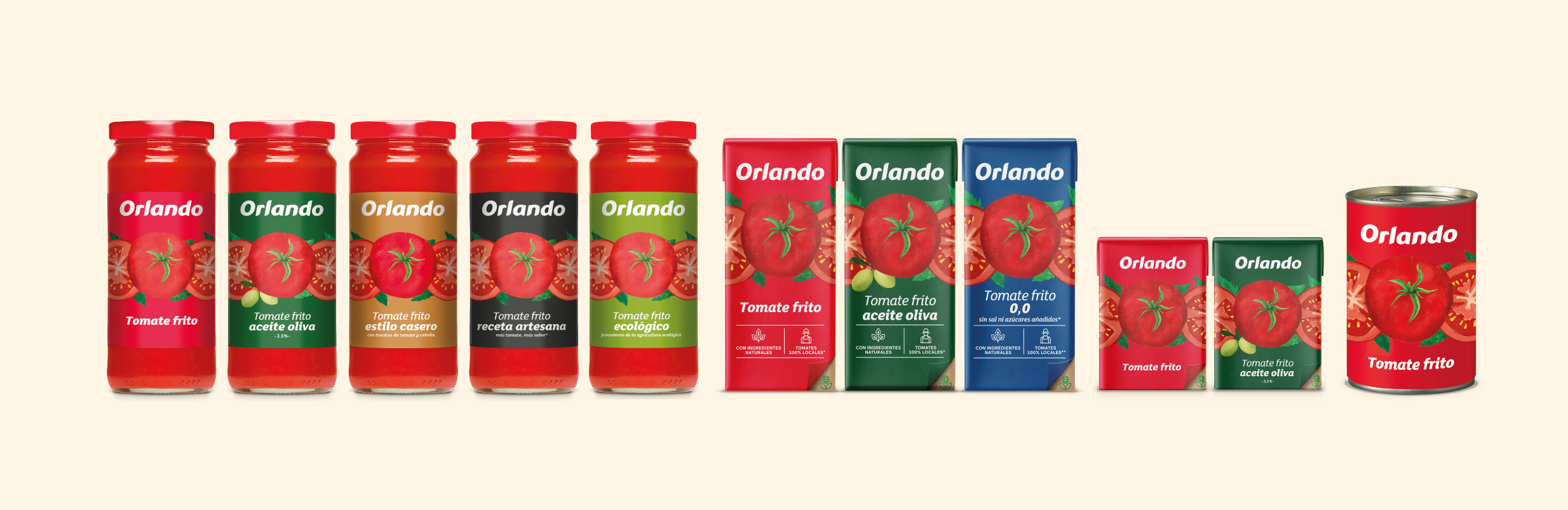
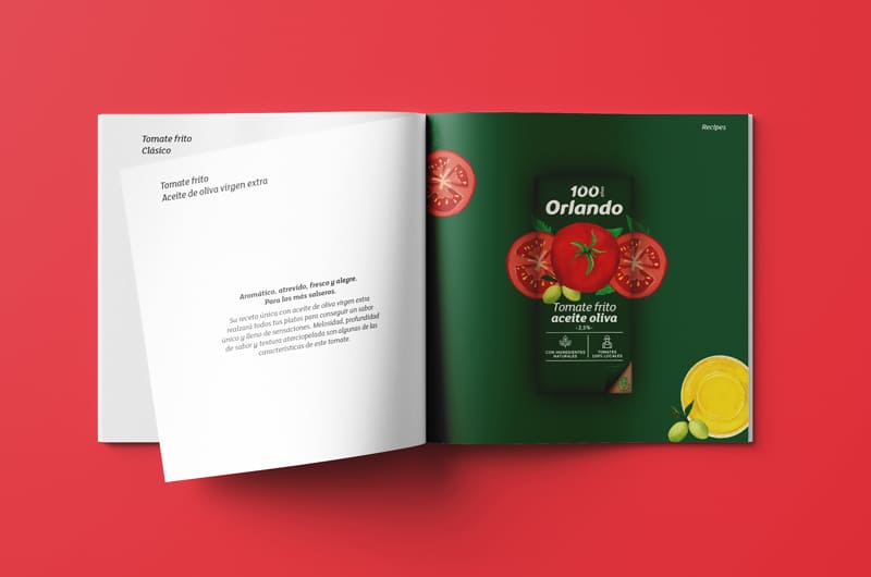
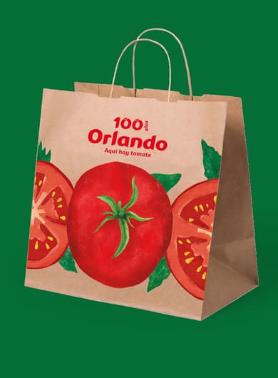
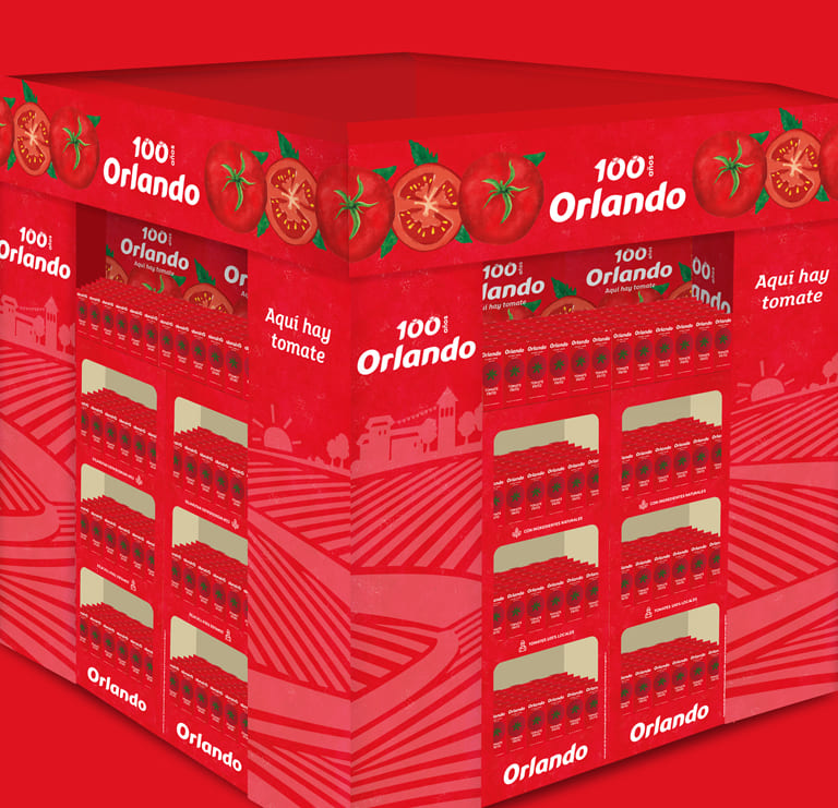
Redesign of all Orlando Tomato ranges across formats. Packaging and masterbrand to reposition the brand.

Our challenge: Increase the relevance of our iconic Orlando brand by engaging younger Spanish families

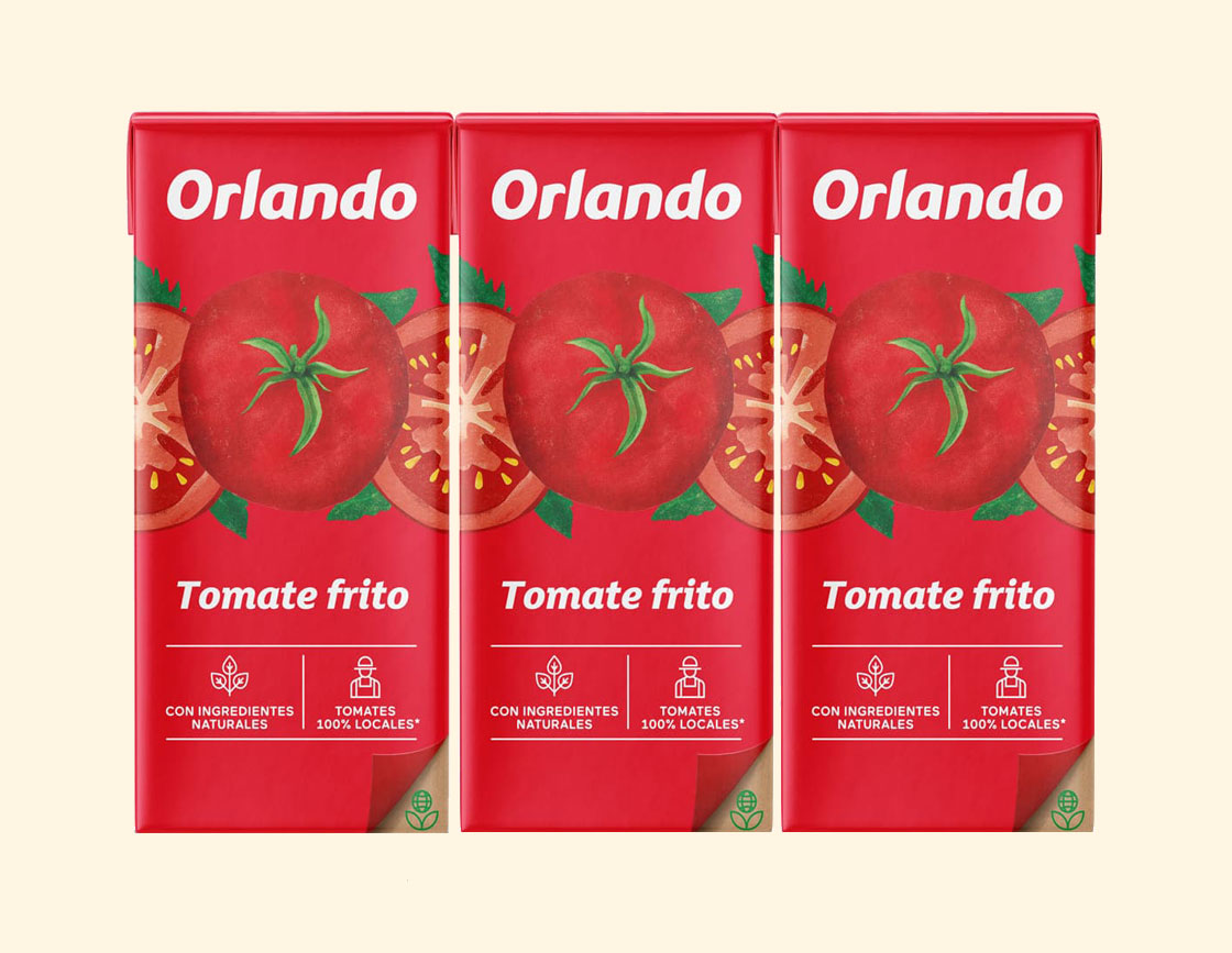
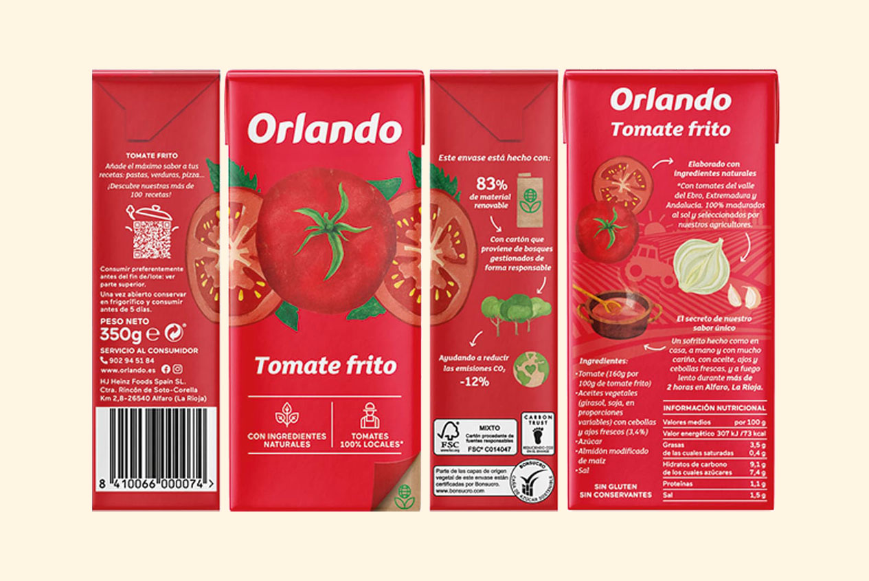
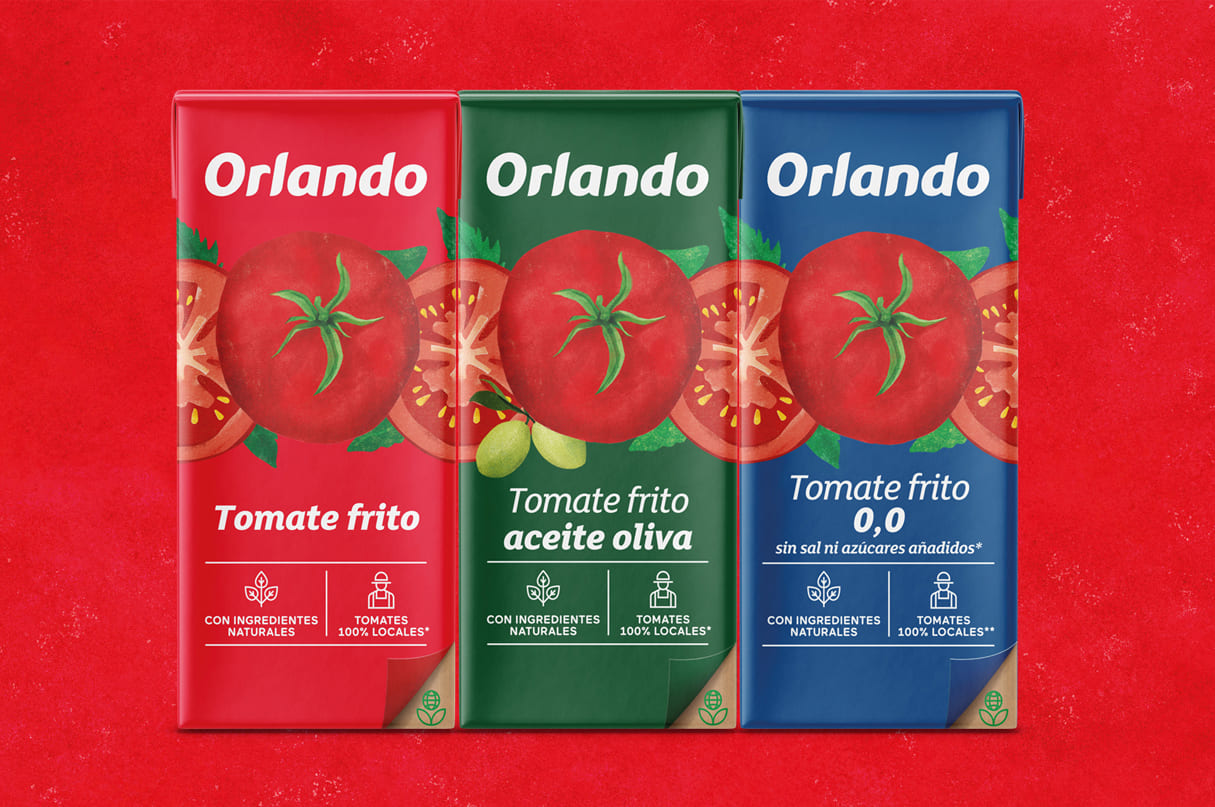
Creative idea: To transfer to the shelf the naturalness of the countryside together with creativity in the kitchen, with manual illustrations made by the illustrator Eugènia Anglès, which allow combining facings and creating a collective identity through borders.

Messages to convey:

100% sun-ripened tomatoes and natural ingredients carefully selected by our farmers.

100% local tomatoes from the Ebro Valley, Extremadura and Andalusia.

More sustainable packaging with 83% plant-based materials and 12% less CO2 emissions.

Content Marketing Strategy, Branding, Packaging, Customer Selling Story, Awareness, Consideration, Convert
Client: Kraft – Heinz

ES  |  CAT EN

arte:
m. o. f. Manifestación de la actividad humana mediante la cual se interpreta lo real o se plasma lo imaginado con recursos plásticos, lingüísticos o sonoros.

maña:
f. Destreza, habilidad.

25 años narrando historias a través del diseño.

Privacy Overview

This website uses cookies so that we can provide you with the best user experience possible. Cookie information is stored in your browser and performs functions such as recognising you when you return to our website and helping our team to understand which sections of the website you find most interesting and useful.

Strictly Necessary Cookies

Strictly Necessary Cookie should be enabled at all times so that we can save your preferences for cookie settings.

Analytics

This website uses Google Analytics to collect anonymous information such as the number of visitors to the site, and the most popular pages.

Keeping this cookie enabled helps us to improve our website.